
Is your website ready for Mobilegeddon?
Here’s what you need to know to avoid falling off the map after the Google mobile friendly algorithm update.
It’s Mobilegeddon! It’s the Mobilepocalypse! The sky is falling! Run for the hills. Stockpile food and water and canned goods. The new Google mobile friendly algorithm is here! All is doomed!
If you’ve been reading anything coming out of the marketing media lately, these doomsday prophecies are dominating the conversation. But is Google’s latest algorithm change really that big a deal? How will it affect you? Most important, what should you do about it?

Here’s the story:
On April 21, 2015, Google changed the way it ranks websites. In the simplest terms, the new update prioritizes mobile-friendly websites and pushes mobile-unfriendly sites down the search rankings.
Here’s Google’s summary of the update:
“Starting April 21, we will be expanding our use of mobile-friendliness as a ranking signal. This change will affect mobile searches in all languages worldwide and will have a significant impact in our search results. Consequently, users will find it easier to get relevant, high quality search results that are optimized for their devices.”
Is it really that big a deal?
How significant is this new mobile-friendly algorithm? After all, Google tweaks its algorithm all the time, as in multiple times a day, hundreds of times a year. So how big was this change?
Big.
According to Zineb Ait Bahajji from the Google Webmaster Trends team, this change surpasses both Google Panda and Google Penguin in terms of its impact on search results. If you aren’t familiar with Panda and Penguin, those two algorithm updates turned search results upside down and essentially ended the traditional search engine optimization (SEO) industry. So, yeah, an algorithm change that promises to be more significant is a big deal. Very big.
How does this affect you?
If your site isn’t mobile friendly, you will probably see a drop in the site’s search rankings, and very likely your overall traffic. If your site is fully optimized for mobile devices, then you should be in pretty good shape, though you should still do an overall review to make sure the site is still responding properly to different screen sizes, browsers and formats.
How big a drop? It’s hard to say. It will vary by site, and the change may be most noticeable as you review your keyword rankings and overall site traffic over time.
Want to check your status? Lucky for you, Google has provided this handy tool to test your mobile optimization:
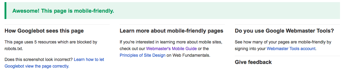
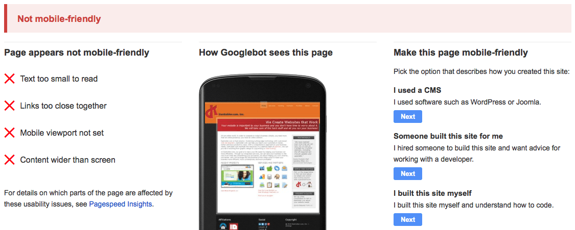
Plug in your website URL and click the “Analyze” button. Google does some nifty, super-fast calculations and returns a simple assessment of whether or not your site is mobile-friendly. It also tells you how the Googlebot sees your website, and outlines problems or potential problems.
A site that’s been optimized for mobile gets a message like this:
A site that’s not mobile friendly will receive a message like this:
What should you do about Mobilegeddon?
If you’re coming up aces in the Google Mobile-Friendly Test, then you can breathe a sigh of relief. You might be able to benefit from a more in-depth website assessment to make sure that your site and other online properties (social media, blog, etc.) are up to best practices, but specific to the Google algorithm update, you’re okay.
If you received a failing grade from the Google Mobile-Friendly Test, then you need to make your site more mobile accessible. It’s that simple. Google has drawn a line in the sand and said that “mobile matters.” In fact, a recent study shows that 50% of Google searches are now conducted with mobile devices. So it’s probably safe to say that they’re right on this one.
The good news is that you may not even need a full website redesign. Updating a non-mobile-friendly site may be as simple as migrating it to a responsive platform. Plenty of web development companies, Campfire Digital included, do this kind of work all the time, and there are established protocols for properly updating and optimizing sites without rebuilding them from the ground up.
When you do upgrade your website to a mobile-friendly version, there are three primary options:
- Responsive Design. Responsive website design automatically adjusts the web page layout for the screen size of the device. There is no need to run a separate desktop site and mobile site because the main website will automatically adapt to provide the optimal viewing experience. You have one URL and one set of HTML code, not different setups for different applications. Responsive design is also Google’s preferred route to mobile optimization. Why? Because Google is all about user experience (and generating billions of dollars in ad revenue), and responsively designed websites generally offer the most seamless user experience between desktop and mobile. Campfire Digital builds all our clients’ sites on a responsive platform as a matter of best practice, and as a way to help our clients run more streamlined, efficient campaigns.
- Dynamic Serving. Similar to responsive design, dynamic serving approach uses one URL and adjusts the screen layout for the device. Dynamic serving uses things called “user-agents” to determine what kind of device the viewer is using, and then provides the appropriate screen layout. However, the HTML code changes from desktop to mobile versions of the site. Dynamic serving passes the basic Google Mobile Friendly Test, though Google has stated that this user-agent detection method can be unreliable, so it’s not the preferred method.
- Mobile Website. A mobile website is a separate version of the main website created specifically for mobile devices. Websites with this configuration have some code in place that tries to determine the device being used by the viewer, and then the site sends that viewer to the appropriate version of the site. This was one of the earliest methods of mobile optimization, and a lot of web developers and do-it-yourself website systems still use it today. It passes the Google test for mobile friendliness, but it’s not the preferred method because it requires website owners to maintain two versions of the same site—and Google also has to crawl two versions of the same site to generate search results. This can lead to inconsistencies (not to mention redunhttps://campfiredigital.com/wp-content/uploads/2025/01/themanifest-logo.jpgt work), and it can also lead to problems if a user clicks on the link for the wrong version of the site. For example, maybe one of your customers shares the link for your website on Facebook, but they post only the desktop version. If one of their friends clicks on that link while using a smartphone, the user experience will be less than ideal. Campfire Digital recommends that businesses using a separate mobile website consider migrating their site to a responsive platform.
What else could cause problems in Mobilegeddon?
Be careful about using things like flash video or other auto-play content that isn’t compatible with mobile devices, particularly on your home page. If you have a big, non-video-compatible media player on your home page, Google essentially sees that section as a blank space. That’s not good for your search results.
You’ll also want to consider things like font size and the length of any forms on the homepage of your website (shorter forms are generally preferable for mobile devices). Also, the speed with which your site loads is critical for mobile users (the faster the better).
Check out Google’s list of common mistakes for more mobile-unfriendly things to avoid.
So is it really the end of the online search world as we know it?
No, Chicken Little can put a cork in it. The sky isn’t really falling—or at least it shouldn’t for most of us. Google has shaken up the SEO and web development worlds repeatedly over the past few years, but their changes have consistently been about delivering better results for their users. They have been very clear: If you maintain a modern, updated website and provide useful content for your audience, you will do well in search results. And they’ve held true to that message. Panda, Penguin, Mobilegeddon—these changes were all about creating better search results and steering Google users to websites that offer the best, most genuine information for their queries.
So what’s the takeaway? Think about your users’ experience first, and build from there. Is your site easy to navigate? Is the design appealing and intuitive? Is the content informational and clear? Does the site work well on multiple devices, from desktops to mobile phones? If so, and if you continue to follow basic best practices for your online presence, then you’ll reap the benefits of search engines that are looking for above-the-board players like you.
If you’re unsure about your level of mobile friendliness, or how to best optimize your site for a comprehensive approach to search engine optimization, Campfire Digital is offering a limited-time free website assessment. We’ll look at your mobile elements, your SEO, your design, your content, your social media integration and more.